01
Hiding the price kills the enquiry
Fitness is the worst offender for "contact us for pricing". People assume the worst and go to the studio that published a number.
Website design
Nobody signs up to a gym from a website. They book one session, and everything on the page should be pushing towards that single step.
What gets in the way
01
Fitness is the worst offender for "contact us for pricing". People assume the worst and go to the studio that published a number.
02
The thing stopping a beginner is not cost, it is walking in and not knowing what happens. Describe the first session in detail and you remove the real objection.
03
Every gym site uses the same library. A photo of your actual room, with your actual members in it, is worth more than the best stock shot ever taken.
One we built
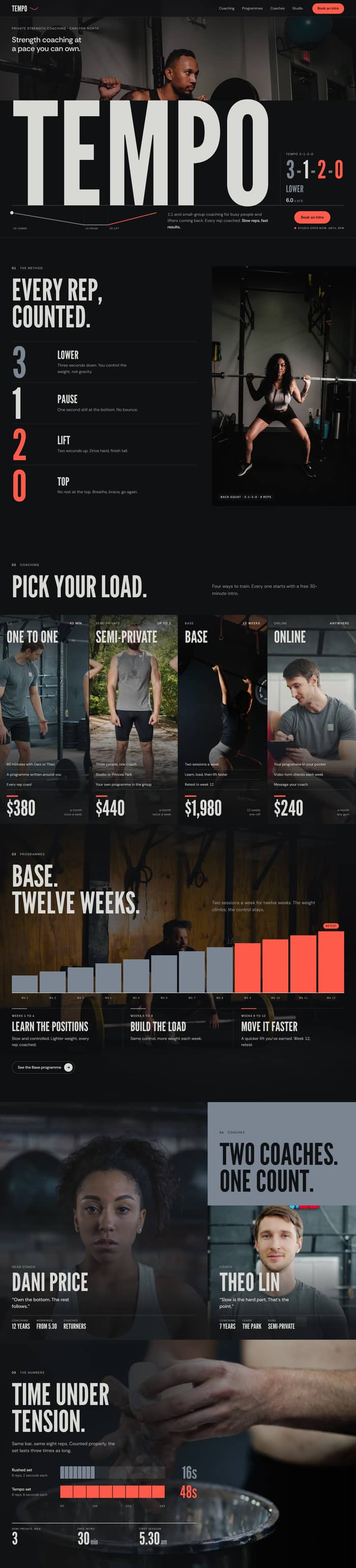 The whole site runs on tempo notation, the 3-1-2-0 that coaches write on a programme, and every claim is a number rather than a promise.
More of the work.
Every site in the portfolio is live, custom coded and built the same way as yours would be.
See all the workAdvanced suits most studios: loud, confident, and built around the first session.
Questions
It links into the timetable and booking system you already run. We build the brochure site, not the membership platform.
Yes. The studios that publish get better enquiries. If your pricing is genuinely variable, publish the first session and the range.
Standard at $995 is usually enough for one trainer: one page, what you do, who you are good with and how to book the first session.
Tell us what the site has to do and we'll be in touch the same day or the next.